TIMELINE
Four Months
SKILLS
Legacy redesign, Systems thinking
ROLE
Lead Designer


A legacy feature transformed into an intuitive collaboration tool. Reduces configuration time from 2-3 minutes to 15 seconds.
Context
During my summer 2024 internship on the Confluence Page Extensions team at Atlassian, I inherited what seemed like a straightforward project. The goal was to improve the anchor macro, a feature that allows users to create a hyperlink to a specific part of a Confluence page. What I discovered was a feature so broken that the team had plans to depreciate it.
What is a macro?
Macros are pre-built, functional components that Confluence users can insert into pages, adding capabilities that go beyond basic text and image. The are interactive, and extend the functionality of basic Confluence pages. They are inserted through Confluence’s slash command menu or the elements browser.
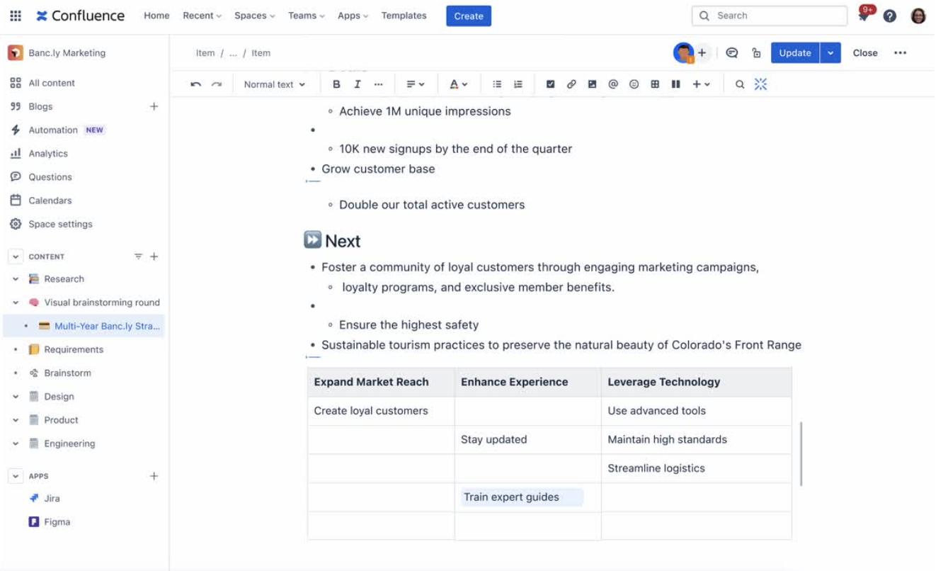
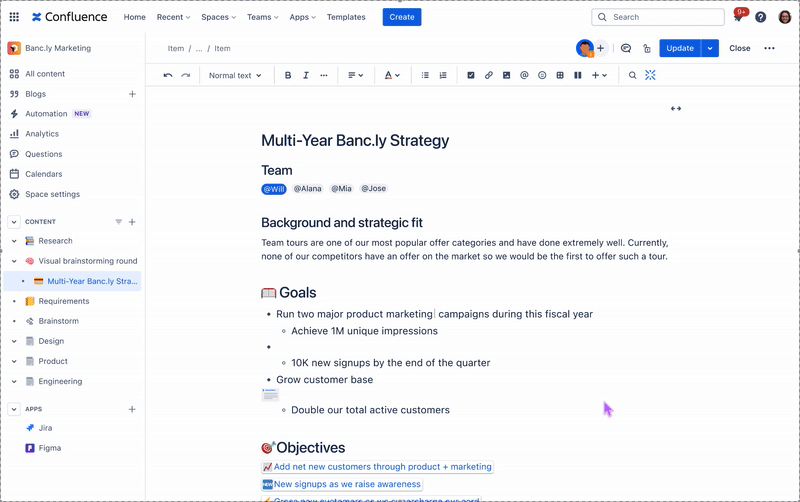
The anchor macro is the 8th most used macro in Confluence. Its particularly helpful on long pages, where collaborators can guide readers to specific areas that require their attention.

The existing experience
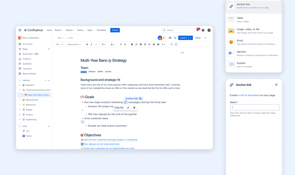
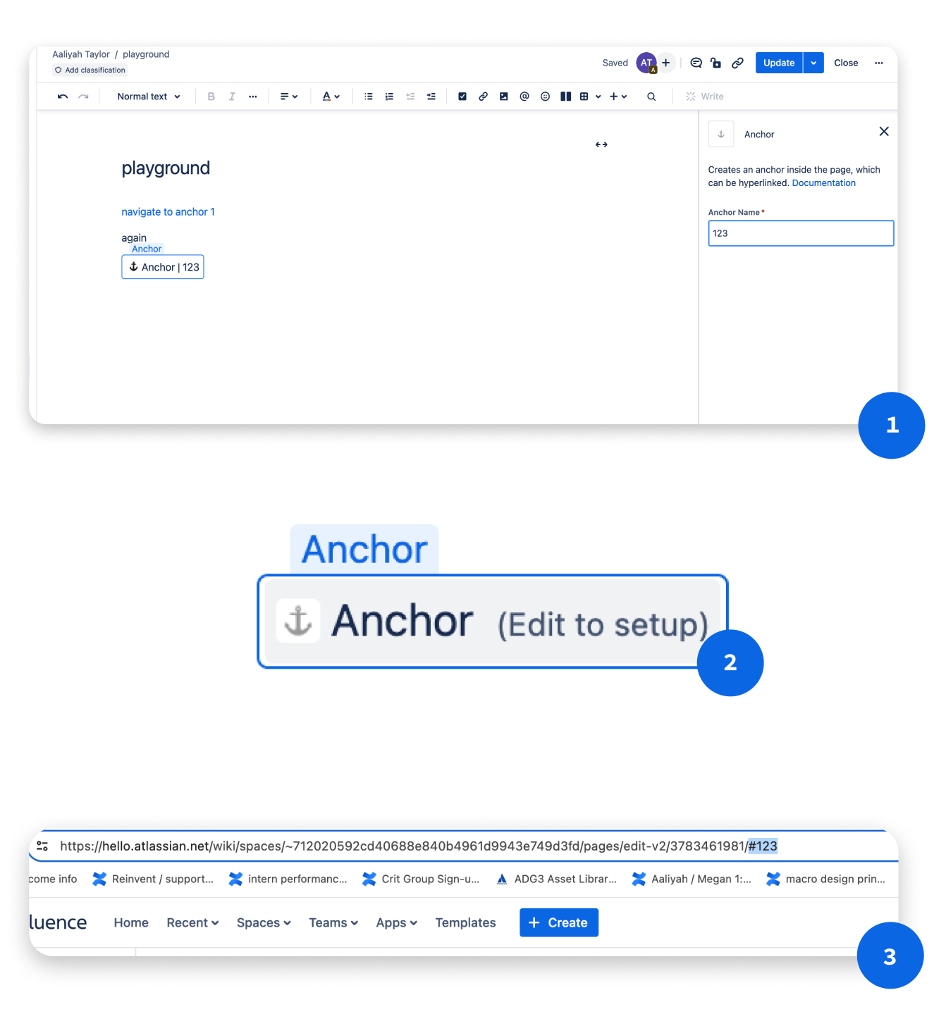
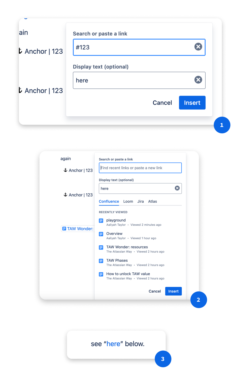
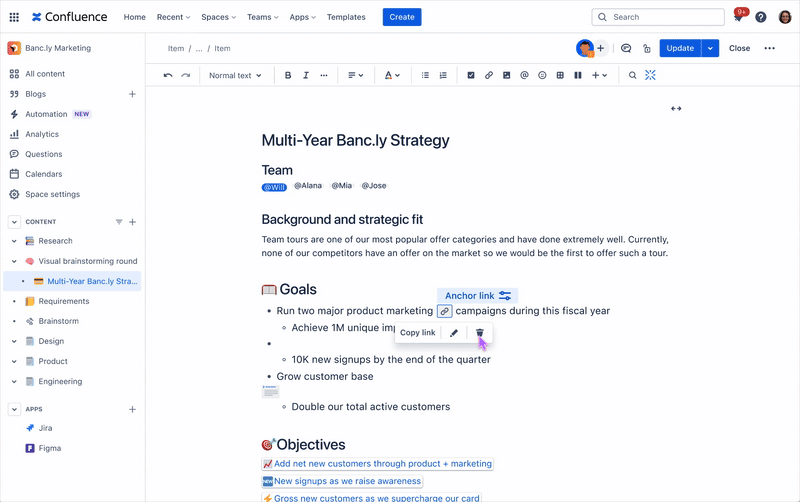
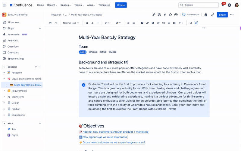
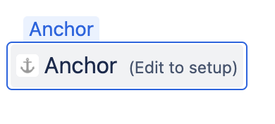
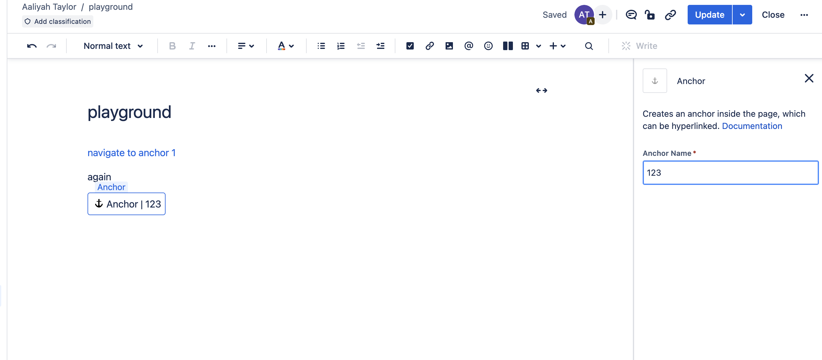
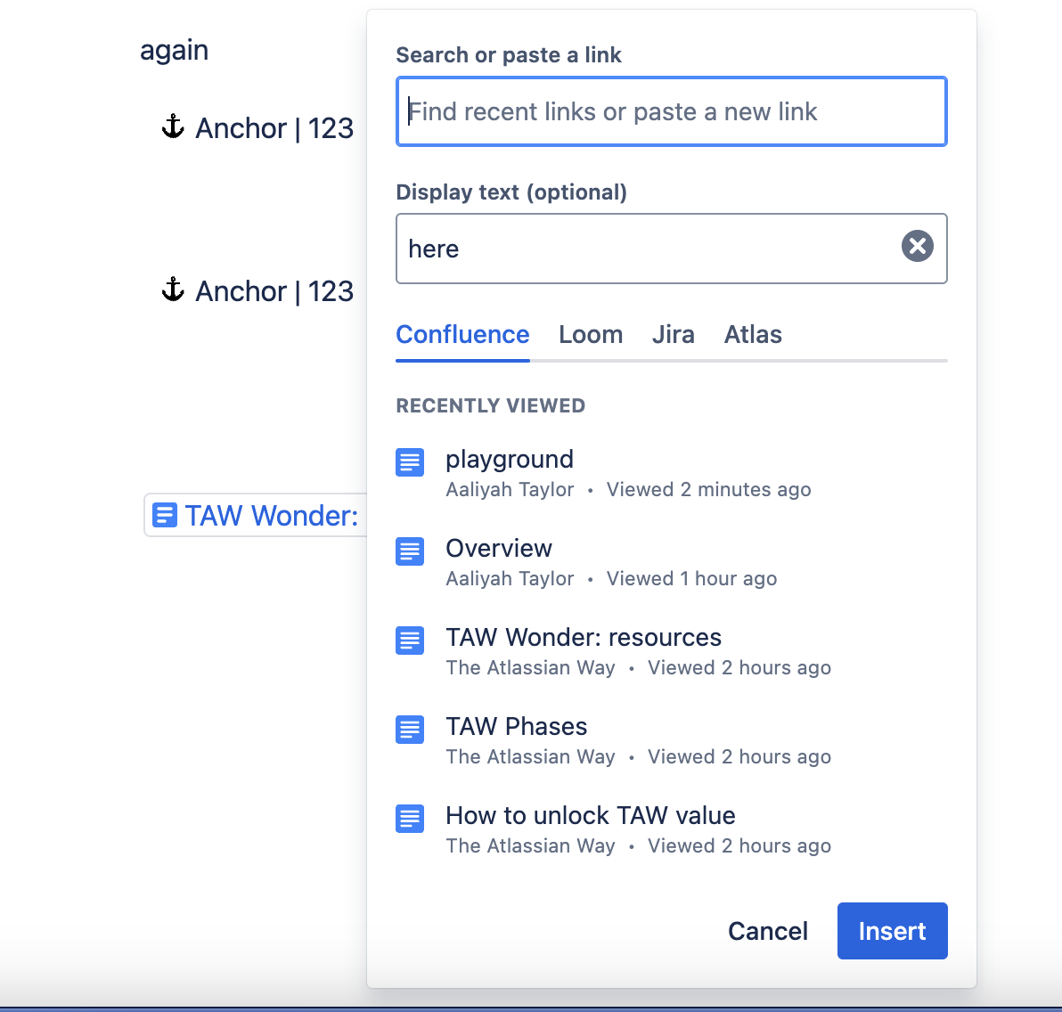
The user must insert the anchor macro, name the anchor in the right rail, and then manually create their anchor link in the URL bar.
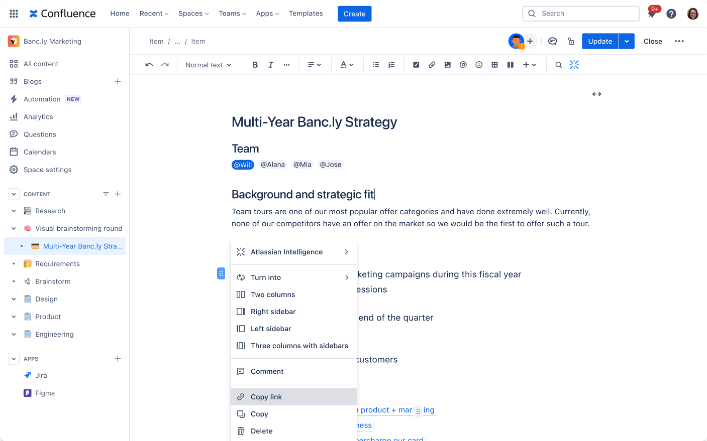
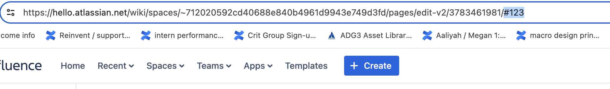
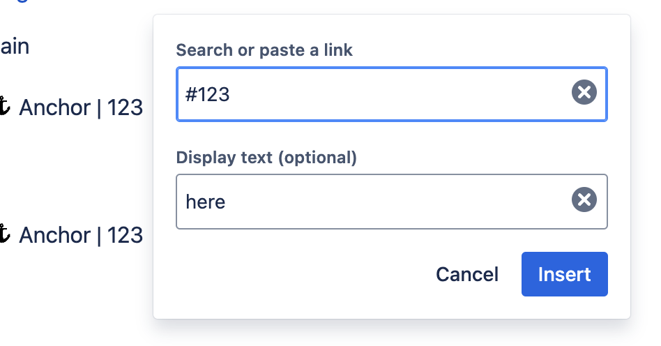
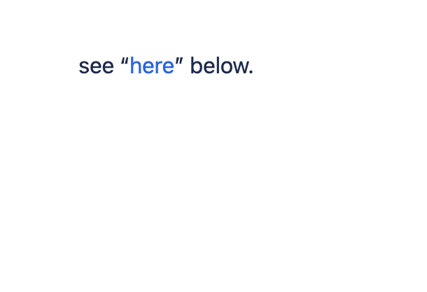
To link an anchor within the editor, the user links #[name] onto a highlighted piece of text.
Why it matters
On the roadmap for Confluence Cloud is the transition to Live Pages, which centers automatic saves and real-time, dynamic editing on documents, with no need to hit the publish button. To make the anchor macro seamlessly compatible with real-time collaboration, its important that all Confluence macros are as WYSIWYG as possible.
Approach + Limitations
Anchor links affect three distinct user groups:

Page creator
Creates and structures page content

Page contributor
Edits and adds content to pages

Passive consumer
Views and navigates published pages
There’s the most friction in the creator experience:
Creator Pain Points
Technical complexity
high
creator
Must fully understand URL structure to manually construct an anchor link — no
guidance or assistance in the editor.
Multi-step workflow
high
creator
Adding an anchor requires 6+ steps across multiple page states — a disproportionate
effort for a simple navigational element.
Poor discoverability
med
creator
The anchor macro is poorly ranked in the slash command menu — invisible unless you
already know its exact name.
For contributors and consumers, the issue is orientation. After using/clicking an anchor link, there's nothing on the page to confirm where you've landed.
Contributor & Consumer Pain Points
No visual indication
high
contributor
consumer
Published pages show no hint that anchors exist — readers can't discover or use them
without being explicitly told.
Broken mental model
med
contributor
consumer
No clear relationship between an anchor name and its function — users can't reason
about what anchors do or why they'd want one.
Content flow interruption
med
contributor
consumer
The anchor macro's visual design disrupts the reading experience for contributors and consumers navigating the page.
Constraints

Design constraint
conceptual mismatch
Unlike most other macros (table macro, status indicators, Jira issues macro etc.) which add tangible elements to a page, anchors are fundamentally about extracting something from the page, creating a reference point for navigation. This mismatch meant that it made more sense for anchor to be less visible in the editing process.
Therefore
It made more sense for anchors to be less visually prominent in the editing experience — high visibility would misrepresent what the element actually
does.

Engineering constraint
framework limitation
The solution had to remain within Confluence's existing macro framework. Anchors couldn't be reimplemented as a non-macro element.
Therefore
The anchor could not auto-generate a link or skip the naming step. Both
require user input by necessity, not by choice.
Defining an MVP
When defining the MVP, I established clear boundaries for what we would exclude due to engineering constraints and project scope. The anchor macro would remain limited to existing entry points (slash command and element browser) since expanding access methods wasn't technically feasible within our timeline. Engineering constraints also required avoiding new configuration options.
Design Recommendation
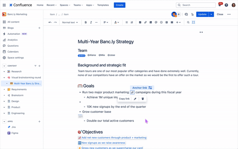
Good (Shipped)

Single-click URL generation — shareable link instantly

Clear anchor identification — visual indication of which anchor is linked

Right-rail configuration still required

Inline presence still disrupts content flow
Editing an anchor placement
Removing an anchor placement
Better

Models existing flow while reducing content disruption

Shows user where the macro is located

Macro constraints cause an unintuitive endpoint

Copy on hover
Navigating to an anchor link
Looking Ahead
While the MVP addressed immediate usability problems, the ideal long-term solution would eliminate the macro framework entirely. Users would simply highlight any content and instantly generate shareable links without inserting separate elements. This would treat anchors as a native page feature rather than an add-on, seamlessly supporting live collaborative editing where multiple users can create and share content references in real-time.
Best (Ideal)

Intuitive — no macro configuration needed

Leverages interaction patterns users already know

Less precision in longer blocks of content
Copy link from drag handle menu
Highlight anchored text on navigation
Takeaways
Owning a design meant challenging even my most basic assumptions. Sometimes the best way to improve something is to replace it entirely. There is also the art of balancing user needs with what the business can actually deliver. I was able to ship a valuable improvement, rather than waiting for the perfect solution.
Working with a project manager, content designer, and engineer within the team taught me the value of stakeholder feedback at every step of the way. I also learned to consider the future of the Confluence Cloud and it’s design system.
© Aaliyah Taylor 2026

work
about
resume
Product Design Internship
Confluence Anchor Macro Reinvention
TIMELINE
Four Months
SKILLS
Legacy redesign, Systems thinking
ROLE
Lead Designer


A legacy feature transformed into an intuitive collaboration tool. Reduces configuration time from 2-3 minutes to 15 seconds.
Context
During my summer 2024 internship on the Confluence Page Extensions team at Atlassian, I inherited what seemed like a straightforward project. The goal was to improve the anchor macro, a feature that allows users to create a hyperlink to a specific part of a Confluence page. What I discovered was a feature so broken that the team had plans to depreciate it.
What is a macro?
Macros are pre-built, functional components that Confluence users can insert into pages, adding capabilities that go beyond basic text and image. The are interactive, and extend the functionality of basic Confluence pages. They are inserted through Confluence’s slash command menu or the elements browser.
The anchor macro is the 8th most used macro in Confluence. Its particularly helpful on long pages, where collaborators can guide readers to specific areas that require their attention.
The existing experience
The user must insert the anchor macro, name the anchor in the right rail, and then manually create their anchor link in the URL bar.

2
3
1
To link an anchor within the editor, the user links #[name] onto a highlighted piece of text.
2
3
1
Why it matters
On the roadmap for Confluence Cloud is the transition to Live Pages, which centers automatic saves and real-time, dynamic editing on documents, with no need to hit the publish button. To make the anchor macro seamlessly compatible with real-time collaboration, its important that all Confluence macros are as WYSIWYG as possible.
Approach + Limitations
Anchor links affect three distinct user groups:
Page creator
Creates and structures page content
Page contributor
Edits and adds content to pages
Passive consumer
Views and navigates published pages
There’s the most friction in the creator experience:
Creator Pain Points
Technical complexity
high
creator
Must fully understand URL structure to manually construct an anchor link — no
guidance or assistance in the editor.
Multi-step workflow
high
creator
Adding an anchor requires 6+ steps across multiple page states — a disproportionate
effort for a simple navigational element.
Poor discoverability
med
creator
The anchor macro is poorly ranked in the slash command menu — invisible unless you
already know its exact name.
For contributors and consumers, the issue is orientation. After using/clicking an anchor link, there's nothing on the page to confirm where you've landed.
Contributor & Consumer Pain Points
No visual indication
high
contributor
consumer
Published pages show no hint that anchors exist — readers can't discover or use them
without being explicitly told.
Broken mental model
med
contributor
consumer
No clear relationship between an anchor name and its function — users can't reason
about what anchors do or why they'd want one.
Content flow interruption
med
contributor
consumer
The anchor macro's visual design disrupts the reading experience for contributors and consumers navigating the page.
Constraints
Design constraint
conceptual mismatch
Unlike most other macros (table macro, status indicators, Jira issues macro etc.) which add tangible elements to a page, anchors are fundamentally about extracting something from the page, creating a reference point for navigation. This mismatch meant that it made more sense for anchor to be less visible in the editing process.
Therefore
It made more sense for anchors to be less visually prominent in the editing
experience — high visibility would misrepresent what the element actually
does.
Engineering constraint
framework limitation
The solution had to remain within Confluence's existing macro framework. Anchors couldn't
be reimplemented as a non-macro element.
Therefore
The anchor could not auto-generate a link or skip the naming step. Both
require user input by necessity, not by choice.
Defining an MVP
When defining the MVP, I established clear boundaries for what we would exclude due to engineering constraints and project scope. The anchor macro would remain limited to existing entry points (slash command and element browser) since expanding access methods wasn't technically feasible within our timeline. Engineering constraints also required avoiding new entry points or configuration options.
Design Recommendation
Good (Shipped)
Single-click URL generation — shareable link instantly
Clear anchor identification — visual indication of which anchor is linked
Right-rail configuration still required
Inline presence still disrupts content flow
Editing an anchor placement
Removing an anchor placement
Better
Models existing flow while reducing content disruption
Shows user where the macro is located
Macro constraints cause an unintuitive endpoint
Copy on hover
Navigating to an anchor link
Looking Ahead
While the MVP addressed immediate usability problems, the ideal long-term solution would eliminate the macro framework entirely. Users would simply highlight any content and instantly generate shareable links without inserting separate elements. This would treat anchors as a native page feature rather than an add-on, seamlessly supporting live collaborative editing where multiple users can create and share content references in real-time.
Best (Ideal)
Intuitive — no macro configuration needed
Leverages interaction patterns users already know
Less precision in longer blocks of content
Copy link from drag handle menu
Highlight anchored text on navigation
Takeaways
Owning a design means challenging even my most basic assumptions. Sometimes the best way to improve something is to replace it entirely. There is also the art of balancing user needs with what the business can actually deliver. I was able to ship a valuable improvement, rather than waiting for the perfect solution.
Working with a project manager, content designer, and engineer within the team taught me the value of stakeholder feedback at every step of the way. I also learned to consider the future of the Confluence Cloud and it’s design system.
Product Design Internship
Confluence Anchor Macro Reinvention
TIMELINE
Four Months
SKILLS
Legacy redesign, Systems thinking
ROLE
Lead Designer


A legacy feature transformed into an intuitive collaboration tool. Reduces configuration time from 2-3 minutes to 15 seconds.
Context
During my summer 2024 internship on the Confluence Page Extensions team at Atlassian, I inherited what seemed like a straightforward project. The goal was to improve the anchor macro, a feature that allows users to create a hyperlink to a specific part of a Confluence page. What I discovered was a feature so broken that the team had plans to depreciate it.
What is a macro?
Macros are pre-built, functional components that Confluence users can insert into pages, adding capabilities that go beyond basic text and image. The are interactive, and extend the functionality of basic Confluence pages. They are inserted through Confluence’s slash command menu or the elements browser.
The anchor macro is the 8th most used macro in Confluence. Its particularly helpful on long pages, where collaborators can guide readers to specific areas that require their attention.
The existing experience
The user must insert the anchor macro, name the anchor in the right rail, and then manually create their anchor link in the URL bar.

3
2
1
To link an anchor within the editor, the user links #[name] onto a highlighted piece of text.
2
3
1
Why it matters
On the roadmap for Confluence Cloud is the transition to Live Pages, which centers automatic saves and real-time, dynamic editing on documents, with no need to hit the publish button. To make the anchor macro seamlessly compatible with real-time collaboration, its important that all Confluence macros are as WYSIWYG as possible.
Approach + Limitations
Anchor links affect three distinct user groups:

Page creator
Creates and structures page content

Page contributor
Edits and adds content to pages

Passive consumer
Views and navigates published pages
There’s the most friction in the creator experience:
Creator Pain Points
Technical complexity
high
creator
Must fully understand URL structure to manually construct an anchor link — no
guidance or assistance in the editor.
Multi-step workflow
high
creator
Adding an anchor requires 6+ steps across multiple page states — a disproportionate
effort for a simple navigational element.
Poor discoverability
med
creator
The anchor macro is poorly ranked in the slash command menu — invisible unless you
already know its exact name.
For contributors and consumers, the issue is orientation. After using/clicking an anchor link, there's nothing on the page to confirm where you've landed.
Contributor & Consumer Pain Points
No visual indication
high
contributor
consumer
Published pages show no hint that anchors exist — readers can't discover or use them
without being explicitly told.
Broken mental model
med
contributor
consumer
No clear relationship between an anchor name and its function — users can't reason
about what anchors do or why they'd want one.
Content flow interruption
med
contributor
consumer
The anchor macro's visual design disrupts the reading experience for contributors and consumers navigating the page.
Constraints

Design constraint
conceptual mismatch
Unlike most other macros (table macro, status indicators, Jira issues macro etc.) which add tangible elements to a page, anchors are fundamentally about extracting something from the page, creating a reference point for navigation. This mismatch meant that it made more sense for anchor to be less visible in the editing process.
Therefore
It made more sense for anchors to be less visually prominent in the editing
experience — high visibility would misrepresent what the element actually
does.

Engineering constraint
framework limitation
The solution had to remain within Confluence's existing macro framework. Anchors couldn't
be reimplemented as a non-macro element.
Therefore
The anchor could not auto-generate a link or skip the naming step. Both
require user input by necessity, not by choice.
Defining an MVP
When defining the MVP, I established clear boundaries for what we would exclude due to engineering constraints and project scope. The anchor macro would remain limited to existing entry points (slash command and element browser) since expanding access methods wasn't technically feasible within our timeline. Engineering constraints also required avoiding new entry points or configuration options.
Design Recommendation
Good (Shipped)

Single-click URL generation — shareable link instantly

Clear anchor identification — visual indication of which anchor is linked

Right-rail configuration still required

Inline presence still disrupts content flow
Editing an anchor placement
Removing an anchor placement
Better

Models existing flow while reducing content disruption
Shows user where the macro is located

Macro constraints cause an unintuitive endpoint
Copy on hover
Navigating to an anchor link
Looking Ahead
While the MVP addressed immediate usability problems, the ideal long-term solution would eliminate the macro framework entirely. Users would simply highlight any content and instantly generate shareable links without inserting separate elements. This would treat anchors as a native page feature rather than an add-on, seamlessly supporting live collaborative editing where multiple users can create and share content references in real-time.
Best (Ideal)
Intuitive — no macro configuration needed
Leverages interaction patterns users already know
Less precision in longer blocks of content
Copy link from drag handle menu
Highlight anchored text on navigation
Takeaways
Owning a design means challenging even my most basic assumptions. Sometimes the best way to improve something is to replace it entirely. There is also the art of balancing user needs with what the business can actually deliver. I was able to ship a valuable improvement, rather than waiting for the perfect solution.
Working with a project manager, content designer, and engineer within the team taught me the value of stakeholder feedback at every step of the way. I also learned to consider the future of the Confluence Cloud and it’s design system.
© Aaliyah Taylor 2026